
Launched
Incredibles is an edibles brand and a client I supported through a full end-to-end website rebuild (covered in a separate case study). While designing the new site, I also led the creation of a scalable design system to unify the brand across multiple websites, ensure visual consistency, and streamline workflows among design, engineering, and product.
Client
incredibles (sub-brand of Green Thumb Cannabis)
Tool
Figma
My Role
UI/UX Designer
Team
Product Manager, Developer, QA Engineer
Skills
UI/UX Design
Visual Design
Interactive prototyping
Team collaboration
Overview
The Problem
Before the rebuild, the brand operated across three separate sites, each with its own UI patterns, inconsistencies, and disconnected layouts. There was no existing design system, so every page was recreated from scratch, leading to visual drift, slower development, and a fragmented brand identity.
Goal
My goal was to build a system that not only strengthened brand expression, but also became the single source of truth for all UI decisions, enabling the team to launch new flavor drops and seasonal campaigns faster and more consistently.
My Process
1. Audit & Brand Alignment
I began by reviewing the brand guidelines provided by the clients marketing team, understanding the creative direction, and auditing all existing screens across their three websites. This helped surface inconsistencies and define what the future unified system should look like.

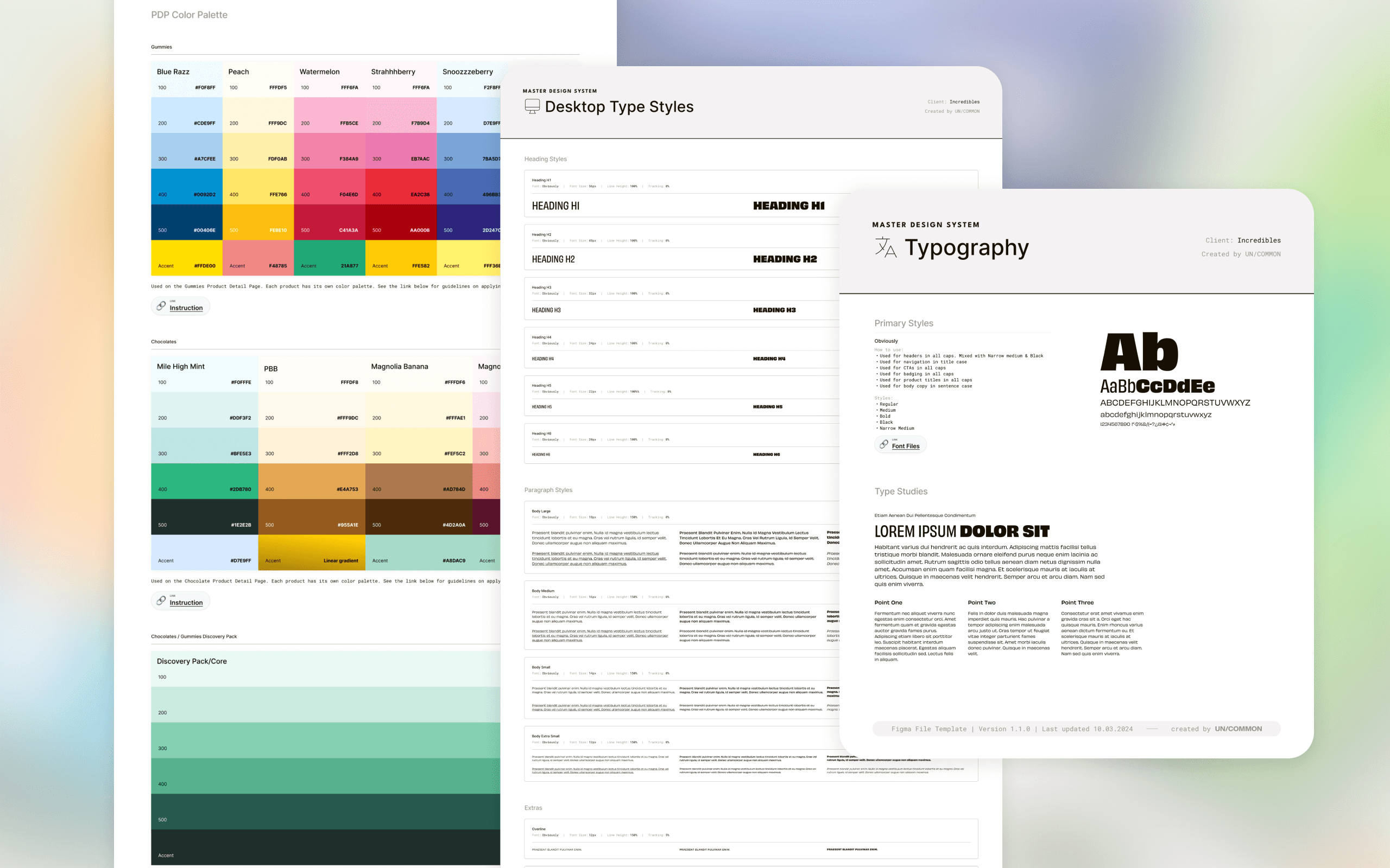
2. Applying Tokens Using Figma Variables
I began by setting up Figma Variables and defining the primitive tokens for color, spacing, typography, and effects. These primitives act as the foundation for all semantic tokens and components, ensuring that any future updates cascade consistently across the entire system.

Style Guide Development
With the tokens in place, I created a complete style guide that detailed the brand’s typography, color palettes, logo rules, spacing system, iconography, and motion guidelines. This provided clarity for the team and ensured that both design and engineering had the same reference point during the rebuild.

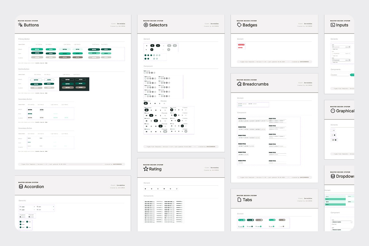
4. Core Component Library
Using the tokenized foundations, I built out the full component library. This included buttons, navigation, banners, badges, form elements, modals, product cards, and other key ecommerce modules. Every component was designed with clear naming conventions, usage rules, states, and developer-ready specifications. I also created multiple variants to cover different scenarios and edge cases the team might encounter during implementation.


Implementation & Collaboration
Throughout the process, I worked closely with the PM and lead developer to ensure Figma-to-code implementation. I delivered dev-ready specifications, walked the team through each component and variable structure, answered questions during implementation, and performed design QA to ensure the final build matched the intended design system. This collaboration reduced rework, increased accuracy, and helped the team adopt the system with confidence.

Next Steps
Moving forward, the system has room to expand with additional components and more ecommerce focused sections that the team can use without design involvement, as well as guidance that supports onboarding new designers. Through this project, I learned the importance of establishing a strong token architecture early and creating a clear contribution model to keep the system scalable as the product grows
